Map Projections Explained: Why Flat Maps Distort Size
Every flat map of a round Earth distorts something. See how Mercator inflates high-latitude countries, and what the alternatives trade away.
Map2Maps Team
You cannot flatten a sphere without distorting something. Every world map ever printed has made a choice about what to sacrifice — shape, area, distance, or direction — and the choice made by the map hanging in most classrooms and loading in most browsers has been quietly warping people's sense of world geography for over 450 years.
Key Takeaways: - At 60° latitude, the Mercator projection doubles a landmass's apparent size versus the equator; at 80° it multiplies it by nearly 6x - Google Maps and most web maps still use a Mercator variant, because it keeps compass directions straight, not because it shows size accurately - Equal-area projections fix size but distort shape instead — there is no projection that gets both right
What a Map Projection Actually Does
A projection is a mathematical method for translating the curved surface of the Earth onto a flat plane. That translation cannot preserve everything at once: area, shape, distance, and direction all trade off against each other, and a projection can hold on to at most a couple of them at the cost of the rest. Every world map you have ever looked at made this trade whether or not it told you so.
The Mercator Trap
The Mercator projection, designed in 1569, keeps compass bearings as straight lines, which made it genuinely essential for maritime navigation. To do that, it has to stretch land progressively as it moves away from the equator, and the stretching accelerates the closer you get to the poles.
The scale factor is the multiplier a projection applies to a given latitude. On Mercator it follows a simple rule: 1 divided by the cosine of the latitude. The consequence is a projection that is nearly accurate near the equator and wildly inflated near the poles:
| Latitude | Mercator scale factor |
|---|---|
| 0° (equator) | 1.00x |
| 30° | 1.15x |
| 45° | 1.41x |
| 60° | 2.00x |
| 70° | 2.92x |
| 80° | 5.76x |
At 60° latitude — roughly where Norway, Sweden, and southern Alaska sit — a country's apparent area on a Mercator map is already double its true size. That single number explains most of the "wait, really?" moments across every size comparison on this site.
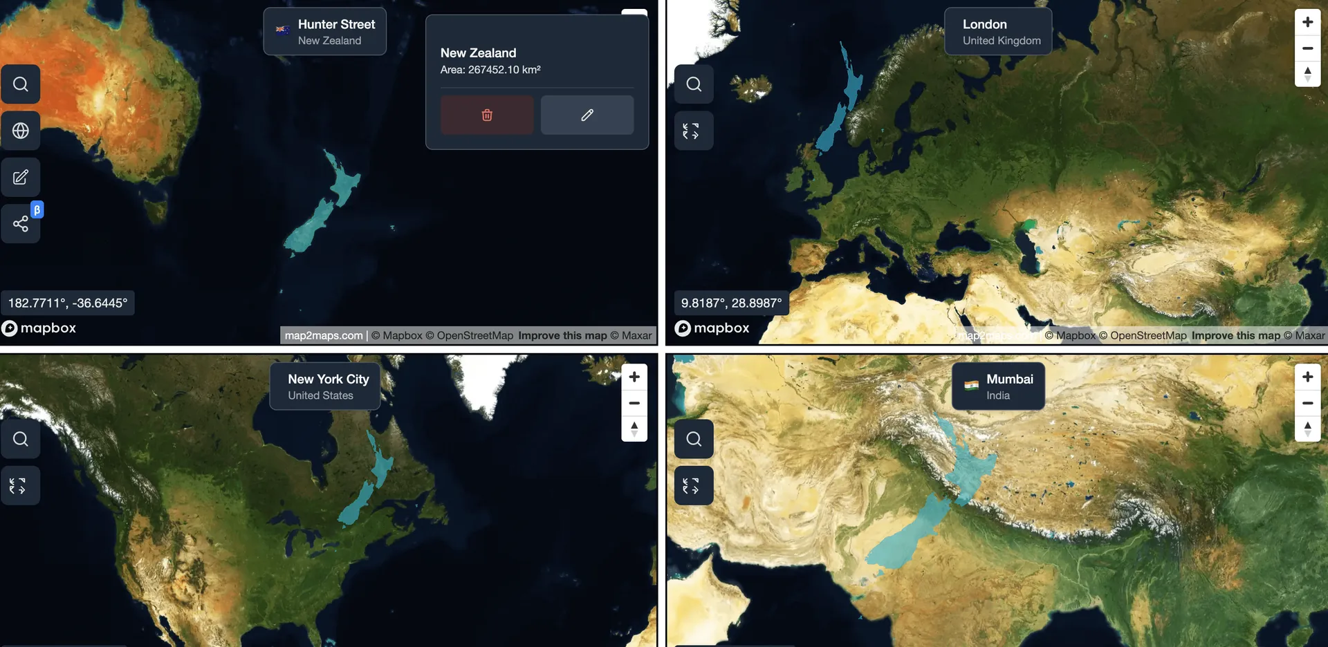
Pick any two countries on our interactive map and drag one onto the other. The overlay shows true relative size, with none of Mercator's latitude bias.
The Alternatives, and What They Give Up Instead
Equal-area projections — Gall-Peters, Mollweide, Eckert IV, Equal Earth — fix the size problem directly: a country's area on the map is genuinely proportional to its real area, no matter its latitude. The cost is shape. Gall-Peters in particular stretches landmasses near the poles vertically and those near the equator horizontally, so countries end up recognizable but visibly warped, tall and thin or short and wide in ways that don't match their actual outlines.
Compromise projections like Robinson and Winkel Tripel, common in atlases and classroom wall maps, split the difference: neither area nor shape is fully accurate, but neither is wildly wrong either. Equal Earth, introduced in 2018, is a newer compromise projection built specifically to look more natural than Gall-Peters while staying much closer to true area than Mercator.
There is no projection that gets shape, area, distance, and direction all correct simultaneously. Mathematically, it cannot be done on a flat surface — Carl Friedrich Gauss's Theorema Egregium proves that a sphere's curvature cannot be preserved on a plane without distortion. Every choice of projection is a choice of which distortion to accept.
Why Web Maps Still Default to Mercator
Google Maps, Apple Maps, and most other web mapping platforms use Web Mercator, a variant built for a different reason than 16th-century navigation: it makes square map tiles that align cleanly at every zoom level, and it preserves local shape well enough that streets and buildings look correct at street level. Those are real engineering advantages for a zoomable street map. They say nothing about whether the projection is a fair way to compare Greenland to Africa, or Canada to Europe, at the zoomed-out world view — and it is not.
Compare Any Country on Earth
Save unlimited comparisons and return to them whenever you need them, with priority support included.
Distortion in Practice: Four Real Examples
These aren't abstract multipliers. Each of these comparisons on this site exists because a Mercator map gets the relationship visibly wrong:
- Greenland vs. Africa: Greenland looks nearly as large as Africa on a standard map. Africa is actually about 14 times bigger.
- Canada vs. Europe: Canada, sitting at high latitude, looks dramatically larger than Europe on Mercator. The real gap is about 2%, in Europe's favor.
- Argentina vs. Algeria: Argentina's southern tip reaches 55°S, inflating it to look nearly twice Algeria's size on Mercator. The real ratio is 1.17 to 1.
- Madagascar: sitting close to the equator, Madagascar is barely inflated by Mercator at all, yet its placement next to a heavily-inflated Greenland makes it look far smaller than its true, larger-than-Germany size.
The pattern is consistent: how close a landmass sits to the equator matters more for its apparent map size than its actual area does.
Why an Overlay Beats Any Single Projection
Reading a single projection correctly requires knowing its distortion pattern and mentally correcting for it, which is not a realistic ask for a quick glance at a map. Overlaying two shapes directly at the same true scale sidesteps the entire problem: instead of trusting a projection's math, you're comparing outlines that have already been placed on equal footing. That is the entire premise of this site's map tool, and it is why every comparison here leads back to it rather than to a static image.
Fun Facts
- The Mercator projection was originally designed for one specific use, marine navigation, and was never intended for wall maps or atlases at all.
- The Gall-Peters projection became politically controversial in the 1970s and 80s precisely because it corrected the size bias that had, for centuries, made colonial powers near the poles look larger than the equatorial regions they colonized.
- The Equal Earth projection, published in 2018, was designed by cartographers explicitly frustrated with the Gall-Peters projection's shape distortion.
- No flat map projection can simultaneously preserve area, shape, distance, and direction — a mathematical result, not an engineering limitation.
Conclusion
Every flat map lies about something, and the Mercator projection that dominates web mapping lies specifically about size, worse the further from the equator you look. Knowing the scale factor at a given latitude explains a huge share of the "that doesn't look right" reactions people have when they see accurate country comparisons for the first time. The most reliable fix isn't picking a better projection; it's not relying on a projection at all, and overlaying the actual shapes instead.
Sources and method
- Projection mathematics and scale factor: USGS: Map Projections — A Working Manual (Snyder, 1987)
- Curvature and flattening: Theorema Egregium (Gauss)
Method: boundaries come from Natural Earth 3.3.0 (1:50m). Areas are computed with Turf's geodesic area function over the polygon geometry, so they do not depend on the Web Mercator projection used for display. Figures include inland water and follow each source's treatment of disputed boundaries.
Note: Scale factors are computed as 1/cos(latitude), the standard Mercator formula, and apply to the north-south and east-west stretch equally at a given parallel.
Figures checked 22 September 2026.
Frequently Asked Questions
Why does Greenland look so big on world maps?
What map projection is most accurate?
Why do Google Maps and other web maps use Mercator?
What is the difference between Mercator and Gall-Peters?
How much does Mercator distort size at different latitudes?
Use our interactive map tool to overlay any two countries at true scale. For the distortion in action, see Greenland vs. Africa, or the full list of the world's largest countries for more comparisons worth checking yourself.
Related Articles
Bangladesh vs. Greece: Similar Land, 17x the People
Bangladesh covers 148,460 km² to Greece's 131,957 km², about 13% larger. Yet Bangladesh holds nearly 17 times Greece's population.
Colombia vs. Spain: Similar Populations, 4x Wealth Gap
Colombia covers 1,138,910 km² to Spain's 505,370 km², more than double. Populations are nearly identical, yet Spain's economy is 4x bigger.
DR Congo vs. France Size Comparison
DR Congo covers 2,344,858 km² to metropolitan France's 551,695 km², more than 4x larger — yet rarely pictured as one of the world's biggest.
Explore for Yourself
Ready to dive deeper? Compare countries and see how Web Mercator changes their apparent size at different latitudes.
Sponsored
Products we use and recommend
Support Map2Maps by checking out these tools.
Sponsored
Send money internationally with Wise
Save up to 6x on international transfers with real exchange rates
Try WiseSponsored
Learn Languages with Langi.app
Read bite-sized stories with audio to learn languages at your level
Start LearningSponsored
Ship faster with bunny.net
Global CDN, storage, and media delivery tools that keep websites and video fast worldwide.
Explore bunny.netSponsored
Move faster with Raycast
A keyboard-first launcher with extensions, snippets, and AI to speed up everyday work.
Try RaycastSponsored
Build referral programs with Refgrow
A referral program platform for SaaS and AI products with automated tracking, commission management, and payouts.
Explore Refgrow