See Map Distortion Clearly
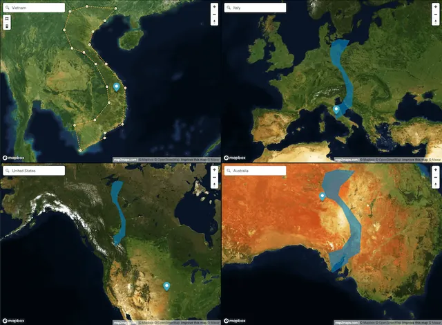
See how Web Mercator changes the apparent size and shape of countries and custom areas as you compare them across multiple map views in real time.
Features
Inspect map distortion for yourself
Select a country or draw an area, then move it across Web Mercator map views to see how latitude changes its apparent size and shape.
- Draw Shapes
Draw polygons or select entire countries to compare their sizes across different maps
- Multiple Views
Compare your shapes across up to 4 different map views simultaneously
- Map Styles
Switch between satellite, street, light, and dark map styles
How It Works
Start comparing in three simple steps
- Choose Your Area
- Select a country from our database or draw your own custom shape on the map.
- Add Map Views
- Add up to 4 different map views to compare your selected area across different perspectives.
- Analyze & Share
- Compare the sizes, save your work, or share it with others.
Latest Insights
Discover Geographic Insights
Explore fascinating articles about geography, map projections, and how the world really looks.
Greenland vs Africa True Size: Visualizing Mercator Map Distortion
On a standard world map, Greenland looks almost as big as Africa. In reality, Africa is about 14 times larger. Here is why the Mercator projection gets this so wrong.
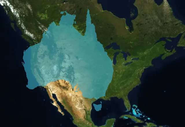
Is Australia Bigger Than the USA? No, the US Is 28% Larger
Australia covers 7,692,024 km² and the United States 9,833,517 km², about 28% larger. Drag Australia onto the US on our interactive map to see it.